Table of Contents
This is a guest post delivered on our request by Carolina Nymark. She has built the largest number of accessibility-ready themes available in the official theme directory. She is currently one of a handful reviewers on the WordPress Theme Review Team who also reviews accessible WordPress themes. She has reviewed over 2,000 themes for the WordPress theme directory.
Themes By Carolina
Making your Divi website accessible means that more people will be able to use it. This means happier visitors, more leads, and more sales.
Did you know that WordPress has an entire team dedicated to improving accessibility? New code added to WordPress needs to follow the Web Content Accessibility Guidelines.
The Web Content Accessibility Guidelines, WCAG, is a set of requirements that describes how to make websites accessible.
The WCAG has three different levels. A, AA, and AAA. AAA is the most strict, and the goal for WordPress is to pass level AA.
With every WordPress update, your website becomes more accessible. That is why one of the best things you can do to make your website more accessible, is to keep your WordPress installation up to date.
Cross-Site Content Copy Paste System for Divi, Gutenberg and Woo
Is Divi an Accessibility Ready WordPress Theme?
In this article I will bring up some accessibility problems with Divi and how to solve them. This is a practical article, to make the most out of it you can follow along and test your own website.
There are many things in Divi that needs to be improved. There are also a few modules that I recommend that you avoid if you want your website to be accessible.
Some problems can be fixed with settings inside Divi. We will use a free plugin to help us solve others.
First, Download the Zip file and install the plugin Divi Accessibility from GitHub. This will add a new menu item called Accessibility under the Divi menu. All options are enabled by default and I recommend that you keep them enabled.
Known issues and how to solve them
Menus
Divi has three menu locations. The primary menu and the secondary menu can be used as drop down menus.
These drop down menus can only be opened with a mouse. This means that visitors who prefers to use a keyboard or cannot use a mouse will not be able to access your content.
Solution: The Divi Accessibility plugin solves this with the Dropdown keyboard navigation option. It adds a small piece of CSS that improves your menus.
Skip link
But what if the menus in your site header are too long?
For people who use a screen reader, it can be annoying to have to listen to the same menus over and over again. For example every time they open a new page or post.
Solution: To avoid this we will add a new link that takes the visitor directly to the content. We need to place the link before any other content on our page.
Add the link by enabling the Screen reader text and the Skip navigation link options in the plugin’s settings page.
The link can be used with the keyboard and with a screen reader, but will be invisible to other visitors. This is what the skip link looks like when the keyboard is used:

Using visible focus outlines
Keyboard users navigate your pages using the tab key and sometimes the arrow keys.
To be able to use forms, buttons and links the user must be able to see which element they have selected.
If you would like to test this, open your website and place the cursor on the address bar. Press the tab key a couple of times, and try to figure out if you are in the header menu or if you have reached the content.
Browsers solve this by showing a thin outline around these elements. Unfortunately in Divi, the outline is hidden.
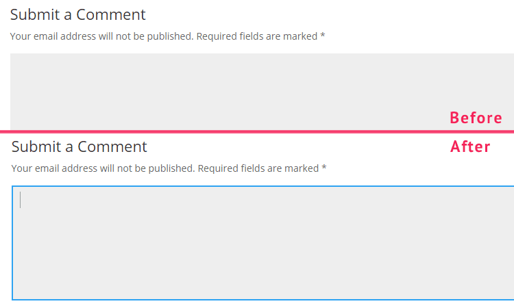
Solution: Enabling the Keyboard navigation outline option adds a new outline. You can adjust the color to better match your website using the Outline colorpicker:

Below you can see the comment form with and without the visible outline:

Color contrast
Colors are important for strengthening your brand. But if your text has a low color contrast against the background it becomes difficult to read.
For example a light grey text against a white background. Or the dark grey color on the black background that is used in the footer of Divi.
WCAG explains that the contrast ratio between text and background color needs to be 4.5:1 for level AA. Unfortunately, all default color schemes in Divi has a contrast ratio that is too low.
Below is an image of two links. The grey color is more visible than the turquoise, which is used when the link is hovered. But it is impossible to tell which parts of the second text that are links, because they are not underlined:

Solution: You can test your website’s color contrast using this tool: https://color.a11y.com/
Using different colors for text and links helps users find the links easier. Some of the colors can be changed in the customizer, others need to be changed in the Divi modules.
Image alt texts
Images that are not decorative needs to have a text alternative for people with low vision, or if the image does not load.
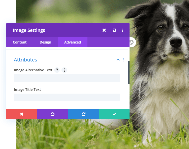
Solution: When you add an image module, go to the Advanced tab and open Attributes. There you will find an option for Image Alternative Text.
- Avoid using the same text as title and alternative text.

Icons and decorative images
Images that are decorative, like icons, should be hidden from screen readers. Otherwise, the names of the icons will be read out loud as text. This interrupts the reading pace.
Solution: Enable the Hide icons option in the The Divi Accessibility plugin.
Writing accessible content
The following tips are universal for writing good accessible content:
- Use the correct headings order. H2 should be followed by H3 and so on, don’t skip heading levels.
- Use short sentences, they are easier to read.
- Don’t write more than 4 lines without adding space between the paragraphs.
- Use lists to break up your content.
- Using images related to your content helps people remember the content.
Adding captions to sound and videos
If you use sound or videos on your website, make sure that there is an alternative for blind and deaf visitors.
This can be a text that is available next to the video, or you can enable captions. Divi does not have any settings for captions. If you are embedding a video from Youtube, the visitor can enable captions in the video player.
Accessibility problems with specific modules
In the beginning of the article I mentioned that there were modules I recommend that you avoid. If it is possible to present content in any other way, avoid using sliders.
Slides that move automatically are difficult for screen reader users to use. Sometimes the slides move too fast. The movement can be distracting or even disorienting if it is unexpected.
Going further
By making sure that everyone can navigate the site you have already made important changes that will make a difference for your visitors.
If you would like to test your website more thoroughly, thank you, you rock! I recommend the following tools:
https://tenon.io/
https://www.deque.com/axe/
https://wave.webaim.org/extension/
The web is by default accessible.
Most of the time improving accessibility means making sure that your website breaks less. It is not about adding extra features, but restoring accessibility.
You can find many tools online that claims to make websites accessible by adding different buttons with extra options e.g. UserWay.
But these tools can actually make it more difficult for visitors to use your website. Instead of installing extra layers on top of Divi, let your visitors use the settings they need: Their own settings.
NEXT: Check our review of Robin Image Optimizer Plugin >


The plugin that you promote here has been closed. I’ve never seen that before.
Thanks for sharing this news. This is a very recent development that we did not hear about.
Anyway, if you cared to check the support tab of the the plugin then you would have find this thread: https://wordpress.org/support/topic/why-the-removal/
It explains the reason for removal (a report about a Trade Mark violation) and the new home (GitHub repo) where they still maintain it and available to download. The plugin is still the best accessibility plugin for Divi websites. The information in this article is still very much relevant.
P.S: We did not received any kick back for this write up so ‘Promote’ is not the correct word to use here.
Thank you for the response and for updating the article. Your dedication is special and appreciated as much information online is left uncorrected.
Yes, the legal team at Elegant Themes seems to be cracking the whip.
I meant no harm in using the word “promote”. I don’t perceive that word to imply a financial relationship. “Advertise” means that, to me. Still, I will consider my words more carefully in the future. You work hard to provide great value. Thank you!
Please note that on github the plugin has not been updated in over a year. DIVI needs to create a fix.
you missed: don’t use “justified text”
the plugin should be resubmit it on the WP repository with a different name so we can update it easily instead of going to gihub, download the new version, delete the old one and install the new one
Thank you, that was profitable
Thank you, that was helpful. My previous message, I didnt see the predictive text until after I hit send!
Thanks for the write up! What about the dot navigation? I am trying the plugin out and when I tab to the dot nav, the keyboard outline will take up the full length of my screen instead of the container of the dot nav. Any quick fixes for this?
Hi, Please submit this matter to the GitHub repo.
https://github.com/campuspress/divi-accessibility/issues
DIVI Sliders use <a href="#" which throws an ADA error anyway to Remove href="#" from the Module?
Good observation. We might be able to apply a temporary fix using JS. The best option would be to raise this issue to ET support team. Since accessibility is a major concern for core WordPress releases they should address this matter in upcoming updates.
We’re having an issue with Contact Form 7 with Divi Accessibility enabled, you cannot enter a space when filling in fields. Interested to see if anyone else has seen this problem before?