
Table of Contents
Divi Sticky Options Introduction
Divi is one of the most popular websites builders in the world - and for good reason. This intuitive, no-code WordPress page builder helps everyone create functional websites without intensive coding. This system ever evolving with new features added every month. In this tutorial we discuss one of such new additions the Sticky Options feature.
The Divi Sticky Options feature allows Divi users to create sticky elements that stay in place regardless of scrolling. With Sticky Options, you can add fixed elements, including sticky headers, menus, CTA buttons, opt-in forms, and many more. Divi Sticky Options are so versatile. They can do so much more than simple fixed positions. Sticky Options offers a new level of control and design flexibility. You can think of it as an advanced system that allows for unique scroll-based interaction and sticky-style adjustment based on the direction that a visitor is scrolling and the element’s position on the page.
This article has curated the best resources for learning the art of using Sticky Options in Divi. Let’s get started!
Divi Full Page Scrolling Framework Child Theme
Elegant Themes Announcement About The New Divi Sticky Options Feature
The Elegant Themes Team introduced Sticky Options to the Divi builder in August 26, 2020. According to the announcement, Divi users can use Sticky Options to stick elements to different positions on the browser viewport. These sticky elements remain visible when the user scrolls up or down the page which is crucial for increasing awareness of certain information.
From sticky menus that aid site navigation to sticky opt-in forms that increase leads, the design possibilities of Divi Sticky Options are endless. Divi Sticky Options lets you tweak the look and feel of sticky behavior, granting you complete design freedom.
Read through the full announcement post to get more details on the new Divi Sticky Options feature.
Complete feature walk through
You can learn more about this new feature by watching the YouTube video above. It's a complete beginner guide to this new sticky options system.
After getting familiar with this new feature lets now explore the 20 Divi tutorials that we think are the best uses of this effect.
20 best practical use cases of Divi Sticky Options
1. Add a sticky header to your site
Unlike regular headers, sticky headers remain fixed to the top of your website. So when users scroll to the bottom or middle of pages on your site, the header won’t disappear. Sticky headers are excellent additions to any website, as they make it easier to use elements in the header. For example, a visitor can quickly access your site’s search and navigation even when they’ve reached the bottom of the page.
2. Create a Clickable Accordion Using Sticky Page Headings
This tutorial details the process behind combining Divi sticky options and anchor links to design a clickable accordion for your website. An accordion is a website design element that comprises vertically stacked headers that readers can expand to reveal or hide content. It can help break up long-form content into bite-sized pieces, promoting a better user experience.
The author relies on Divi’s native design functionalities; no need to write CSS or any code for that matter. Once you learn how to organize content pages with accordion menus, your site’s user experience are sure to improve on both mobile and desktop.
3. Emphasize sticky button in a CTA section
One of the ways you can use Divi Sticky feature is adding fixed call-to-action designs, especially to the bottom of page. This tutorial shows how to make the button inside the CTA section stand out from the rest of the content.
This effect is primarily practical on desktop sites, where you can choose to highlight the CTA button however you want it. Not only does it make the CTA section visually appealing, but it can also increase conversions by drawing users’ attention and nudging them to take the desired action.
The writer shows how to create the design while explaining each step along the way. Ready to design sticky CTA buttons that pop and grab attention? Dive into this info-packed tutorial right now.
4. Stack rows on scroll effect
The effect is simple in operation: once a row reaches the top of the viewport, it goes below the next row in what looks like stacking. While the effect is beautiful, it is suitable for aiding user navigation on your site.
The Elegant Themes blog writer explains how to implement the effect of the stacked row on your site in this novice-friendly tutorial. With easy-to-follow instructions, you should have no difficulty recreating this design.
5. Sticky CTA menu while scrolling down
Sticky CTA menus are used to keep important links visible to site visitors while they navigate your website. In most cases, the sticky CTA menu stays fixed at either the bottom or top of the website.
However, this article from Elegant Themes shows a better way to display sticky CTA menus on Divi sites. The effect, a sticky CTA menu that builds up as the user scrolls down, is easy to replicate if you follow the writer's instructions. By building up the sticky menu while the user navigates the site, you can create a dynamic way of displaying CTA buttons. Its a creative technique for attracting visitors' interest and nudging them to take action.
6. Add a sticky promotional video with show/hide toggle
Adding promo videos to your site is a good way to improve site conversions. It is considerably more enjoyable experience for site visitors to watch a video explaining your services/products instead of expecting them to read pages of content.
In this tutorial, the writer explains how to add a sticky promotional video to your site. This promo video starts playing when the user visits the page and then sticks to the top corner when visitors scroll downwards. You'll also learn how to design a show/hide toggle button for the sticky video that allows users to decide if they want to continue watching it or not.
7. Switch sticky header’s logo on scroll
One of the cool things you can do with Divi Sticky Options is the switch logo on scroll effect. When implemented, this causes the logo in your header to change as the user scrolls. This addition can bolster your site’s aesthetics. This article written by the Elegant Themes guide you how to set up this.
8. Turn hero section headers sticky on scroll
When users visit your site, they want content and a seamless journey throughout the web page. To make navigation on your website easier, you can create hero headers that become fixed (sticky) on scroll.
In this tutorial, you'll learn how to design custom headers for different hero sections and made them sticky when the visitor scrolls through the page. When a user scrolls past the headers, the latter become fixed elements at the top of the page, creating a beautiful effect.
9. Design fixed category menus for Divi blog
A category menu lists all the major topics that your blog covers. For site visitors, a category menu provides them to understand what your blog is about and decide if they are interested in the content. This tutorial breaks down the process of adding fixed category menus to your site. Such menus remain affixed to the viewport's upper area so that users can access the content categories quickly.
10. Add a Sticky sidebar
A sticky or fixed sidebar remains locked to the side of your page and remains visible even as users scroll through the page. Sticky sidebars can be used to display extra information and other related contents.
Any information you include in a sticky sidebar, whether it's an opt-in form, CTA, or Popular Posts section, will get more visibility since the sidebar never disappears. This means a better conversion rate (from CTA buttons), enjoyable suggestions, more subscriptions (from opt-in forms), and better navigation (from navigation elements).
If you think sticky sidebars can be useful to your site then this is the guide you should follow.
11. Design a sticky sidebar CTA section
A traditional sidebar layout may feel intrusive and contain too much information, which may impact the effectiveness of CTA sections added to that region. But what if you could stick a CTA module to the side of the page without using an unappealing scrollable sidebar?
The writer here uses Divi Theme Builder and sticky options to create fixed CTA sections for a blog post template. The result is a page that doesn't feel cluttered up by a big sidebar but still features the important calls to action that will boost conversions.
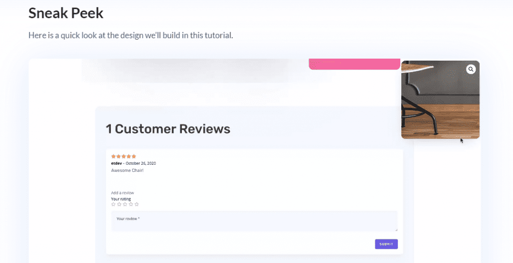
12. Add sticky product images
Having great product images is critical to the success of any online store. As a result, sellers often set up their sites to display product images immediately after a visitor enters the site to build up appetite and encourage purchases.
The problem is, those great product images often disappear as users scroll down the page. In this guide the writer show you how to stick those images to the viewport as the user scroll the page.
13. Design interchanging sticky FAQ section
The author teaches how to design a highly interactive FAQ page where the questions interchange as the user scrolls down. Not only is it more attractive than a regular FAQ section, it helps people quickly find answers to their questions.
14. Design expanding sticky menu on hover
With a sticky menu, site navigation becomes more easier. And with different studies proving the importance of user experience for better conversions, these small changes could result in more earnings!
This article explores how to create a sticky menu that expands when the user hovers above the menu icon. While the expand-on hover effect is remarkable, this functionality promises more friendlier UX than mere aesthetics.
The author uses the Mechanic Layout Pack to build this menu design, and her detailed instructions aren't difficult to grasp. Read this article, reproduce the results on your site, and start giving visitors a better experience.
15. Design a responsive sticky sidebar with jump links
There are times when a sidebar can be intrusive. However, when you have long content pages and want to aid navigation, a responsive sidebar paired with anchor links may be helpful.
Jump links, aka anchor links, allow readers to 'jump' to a section of a page. Including them in a fixed sidebar is good UX because it makes it easier for users to scan information and get what they need. A sticky table of contents widget with anchor links is a good example for this use case.
16. Creating a sticky footer
Would you like a way to add a CTA that follows your visitors while they’re navigating through your website? Consider going for a sticky footer bar. Here, when someone scrolls to the bottom of your page, the footer bar will merge with the standard footer.
17. Transform site elements into sticky items using a plugin
Here you will learn the art of turning any site element (menu, sidebar, CTA, etc.) sticky using a free plugin. Configuring the plugin settings just takes a few seconds. Then all you have to do is give your element a specific CSS ID.
18. Change Styles on Scroll
In this tutorial on how to use Divi’s sticky options, you will learn how to change sticky styles without the elements moving. Specifically, this means that as soon as visitors scroll past a certain area of your page, the styles of that area will change but the elements will stay in place. This type of effect is completely focused on user behavior and is very pleasing to the eye.
19. Add sticky navigation links to Divi page sections
To make your webpage more user-friendly, you can add sticky page navigation buttons to each section. This way, users don't have to scroll constantly or use anchor links in your header menu. Less scrolling and no clunky anchor links!
20. Design Parallax Copy Transitions
In this tutorial you will learn how to create parallax copy transitions with Divi’s sticky options. As soon as site visitor scroll past a certain section, the copy scrolls with the background image. As visitor continue scrolling, it'll be replaced with another title. No matter what size your screen is, it'll look great!
Conclusion
This article has reviewed the best tutorials for learning how to master Divi Sticky Options. Completing most of them will supercharge your design skills and give you the ability to create appealing and functional sticky elements for your Divi site. Do you have any other tutorial you'd like to see included? Make a suggestion in the comments section!
NEXT: 20 Tutorials that teach you how to effectively use Divi Position Options >