Divi Scroll Effect Introduction
The way content is presented while a user scroll is essential from a User experience standpoint. Animations, transitions, and other similar cool effects are content presentation features in Divi that can drastically improve how the user see and interact with your content. If left out a website may feel boring and dead/not live for the visitor. Divi already come packs with smooth scroll effects engine that can help you to creatively present your content.
This article has curated 25 tutorials that teach how to effectively use Scroll Effects in your Divi theme or builder based web site. You can also download related Divi layouts from Elegant Themes blog post. Each tutorial focuses on a specific USE-CASE of this powerful feature, so while it might not be what you want to achieve, it is sure to help you know what is possible!
Divi Full Page Scrolling Framework Child Theme
Elegant Themes Announcement About The New Scroll Effects engine to Divi
In February 5, 2020, the Elegant Themes Team added a new scroll effect feature into the Divi builder, which simplified the process of creating scroll based animations. With it, an element on the Divi page builder canvas can be animated with an on-scroll trigger - base on mouse wheel scroll or the view port.
You can check all the details about this feature in the announcement post.
Complete feature walk through
The youtube video above covers how to use scroll effects and takes you from a complete beginner to a comfortable level.
After getting familiar with the effect lets now explore the 25 Divi tutorials that we think are the best uses of this effect.
25 best practical use cases of Divi Scroll Effects
1. Storytelling using Divi Scroll Effects.
If you're looking for a creative way to tell a story in your web page, then this tut might come handy. From One-page product pages to about us, storytelling makes static content more engaging. This tutorial uses a common company profile scenario to explain how you can practically use Scrolls effects on Divi to tell good stories. It's easy to follow and teaches concepts you can apply to any scenario you might have in mind that requires a storytelling flow.
2. Float Elements within a Section.
Floating some elements on a page can give it an entirely new feel. Not only does it look good, but it can also help the user notice important features they usually wouldn't. An excellent example of where to use this is in product landing pages. A floating image of a physical product has more chances of being noticed than a static one. This article by Jason Champagne explains how to float elements (images and a blurb module) within a section in Divi to create a scrolling effect.
3. Add Scroll Motion Effects to Headlines.
Want to add a cool scroll effect to your headlines? This tutorial walks you through how you can add three different scroll effects to headlines on your Divi pages. With these effects, you can guide user intent and create an easy flow for your content.
4. Stack and Animate Text.
Still on scroll related text animations, in this tutorial, you'll learn how to stack and animate text on scroll. This stacking animation works pretty well with Headings but can also be applied to any text on your Divi pages.
5. Create an Envelope Animation.
An envelope layout that unveils content on scroll? Is that even possible with Divi? Well, this tutorial proves just that. The article guides anyone on how they can set up an envelope layout and apply scroll effects to give users the feel of unveiling an actual envelope online. You might not need this for a project right now, but as a Divi user, the concepts you learn from this tutorial can be applied to other use cases as well.
6. Create a Breakaway Image Transition.
With scroll effects, creating transitions between different sections of your Divi page is possible, and when you have images on an area, they can be used as a transition element. In this tutorial, you learn how to apply a breakaway transition effect on images. When the user scrolls, different pieces of an image come together and assemble to their normal state. Use case? Sectional transitions and Product showcase.
7. Progressively Flash the Steps to a Process.
More on transitions, this tutorial teaches how to apply a progressive flash effect on elements that are triggered on scroll. This can easily be integrated with your page transition flow and add an interactive boost.
8. Animate Parallax Background Images.
For sections with parallax background images, you can take things one step further by applying an animation that adds more depth to the parallax effect. This tutorial guides you through the workflow needed to implement this for any background image with a parallax effect.
9. Create a Column-Colliding Hero Section.
Don't like boring Divi Hero sections? Well, with the new possibilities scroll effects have made available, you don't have to stick to just that. This tutorial walks you through how you can set up columns colliding hero sections. When a user scrolls, columns are merged together, which presents your hero content more interestingly.
10. Synchronize Expanding Copy on Scroll.
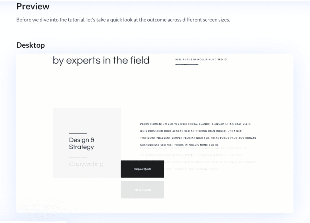
Sometimes, when a user scrolls to a section, a lot of information is presented simultaneously, which can be a bit distracting. With the features Divi Scroll effects provide, it's possible to present this data in a more timed and synchronized manner. In this tutorial, you'll learn how to synchronize expanding copy on scroll using Divi's scroll effects.
11. Create an Expanding Layers Scroll Effect.
This tutorial shows you a simple way to create expanding layers on scroll. All you need to follow along are three images with slight differences that can stack on each other (i.e., Phone Screen Mockup images). It might come in handy when creating single-product landings with Divi.
12. Combine Rotation Scroll Effects with Circular Elements.
In this tutorial, you'll learn how to apply rotation to circular Divi elements like blurbs on scroll. This gives a rolling touch when a user scrolls down the page and can be used to make significant content grab attention.
13. Add a Motion Slide-Out Email Optin Box.
Want to grab attention with your Email opt-in forms? In this tutorial, you'll learn to create a slide-out email box using scroll effects, which are guaranteed to grab any user's attention and increase conversion rates.
14. Reveal Your Image Gallery with a Sliding Puzzle Scroll Effect.
Image galleries these days all look the same, a grid or masonry layout filled with static images. For a more interactive feel, this tutorial guides you through how you can add a puzzle-effect-like transition to your image gallery that triggers on scroll.
15. Create Horizontal Self-Scrolling List.
Making a user use the Horizontal scroll bar to reveal important content is considered bad practice on a UX level. Sometimes, you might want to fit a large chunk of related content in a section that would typically trigger a horizontal scroll bar. Well, with Divi scroll effects, it doesn't have to. This tutorial provides a guide for creating self-scrolling horizontal lists, eliminating the need for a horizontal scrollbar, and presenting extra information like a slide when a user scrolls.
16. Create Blurb Expanding Section on Scroll.
In this tutorial, you'll learn how to create a section with expanding circular blurbs layout on scroll using Divi absolute positioning and scroll effects.

17. Create Circle Counters that Animate on Scroll.
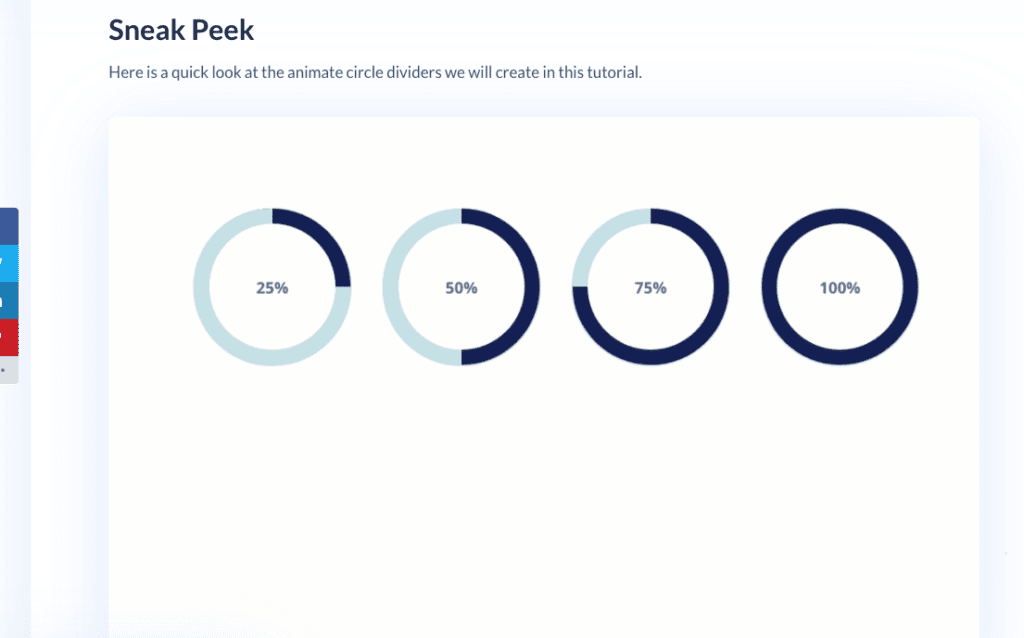
This tutorial will guide you through implementing a scroll animation for circular counter layouts without the need for any external library or CSS code. It works by taking advantage of Divi's Layers feature to manage multiple modules in the same layer.

18. Create Section Divider Scroll Effects.
Not feeling those static section dividers? In this tutorial, using Divi's Scroll effects, you'll be able to animate both top and bottom dividers on scroll. Instead of sticking to the default boring section dividers (curves & lines), you can try out something creative and sure to bring your website to life.
19. Create a Seamless Service Transition.
A big UX problem occur when the page shows too much information here and there on the screen while a user trying to consume the main content. With scroll effects, you can do things like plan how your content should flow using things like transitions and animations. In this tutorial, you will learn how to apply a seamless transition to a service style layout. The concepts you learn here can also be applied to other layouts you might have in mind, so you're not constrained to just service layouts.

20. Create a Zoom-Out Header Transition on Scroll.
In this tutorial, you'll learn how to add a zoom-out transition effect on any header on your Divi canvas. This is a cool effect you can use to highlight important heading and have in your arsenal while planning a page's flow & content presentation.

21. Create 3D Motion Scroll Effects.
In this tutorial, you will learn how to implement 3D motion scroll effects on layouts on your Divi websites. The tutorial uses a simple page layout featuring two design examples and guides you through how you can implement 3D motion scroll effects practically.
22. Add Motion to Background Images on Scroll.
The parallax image effect isn't the only way to make background images look cool. With Divi scroll effects, you can add a range of background image related motion effects. In this tutorial, you'll learn how to add motion scroll effects on images in a list. This will act as a transition while users scroll and increase the general interactivity of your pages.
23. Design a Divi Timeline Layout.
This is one of the best Use-cases for scroll effects; creating interactive timelines would have been somewhat problematic in the past but not anymore. In this tutorial, you'll learn how to create a complete Divi timeline with scroll effects. Completely responsive and easy to follow, it tells the story in any timeline way better than the static alternative.
24. Create an Image Swap on Scroll.
If you're building a product landing page or a showcase of any sort, having images swap smoothly will not only provide a better user experience but also allow you to add more variations of your products and all of them seen in a smart way without taking extra space. In this tutorial, you will learn how to add an image swap transition to a section with different images on scroll.
25. Create Colorful Text Background Scroll Animation.
Custom text background colors with a scroll animation? How cool is that? In this tutorial, you'll learn how to create beautiful color backgrounds for headings on Divi with a motion effect on scroll.
Conclusion
That's it for our list. Divi Scroll effect is definitely a powerful addition that makes a lot of scroll dependent implementations possible. From rotating blurbs of text to animating parallax background images, the possibilities are almost limitless. With the concepts you learn from each tutorial, you can try out new use cases and truly master this new effect.
We hope you found this roundup helpful; if you think we have missed anything, feel free to mention those tutorials in the comment section below.
NEXT: 30 Divi Theme Builder Tutorials to Design Each Section of the Web page Creatively


great post
did you miss the expanding CTA like ET has on their website? i didnt find it
Well, actually the post you are referring (https://go.shorturl.stream/EqyERBK3) wasn’t made using the newly introduced Divi scroll effect. So we did not include that into this list. Back then these effects has to be done with custom code. The new system was introduced in February 5, 2020 so all the tutorials here are use cases of this new addition to the builder.