Table of Contents
Divi Theme Builder Introduction
Divi Builder is one of the most popular WordPress page builders, and for good reason. It allows users to quickly and easily design and build stunning websites without having to know any code. But if you’re looking for something a little more robust, you’ll need to turn to the Divi Theme Builder. Divi Theme Builder is an extension of the Divi Builder that allows you to build areas in the web page that has been traditionally controlled by theme options.
The Divi Builder is a complete set of tools for building amazing websites. The Theme Builder extends these tools to all areas of the Divi Theme, giving you the power to build custom headers, footers, category pages, product templates, blog post templates, 404 pages and more.
In this article, we’re going to be looking at over 30 different Divi theme builder tutorials that teach how to design sections of your website creatively.
We give a brief description of each tutorial and provide a video or link to its source.
No matter what Divi site section you’re trying to build, one of these tutorials should give you a good idea of how to go about it and improve your general Divi page building skills.
Give superpowers to Divi theme with the UDBA plugin
Elegant Themes Announcement About The New Theme Builder Feature to Divi
In October 17, 2019, the Elegant Themes Team introduced highly requested theme builder feature to the Divi builder. This allow users to create templates for different page areas to present contents in more customised fashion, breaking free from default Divi theme template layout and design. This also marked the start of version 4 of Divi.
Find more details about this feature in the announcement post.
Complete feature walk through
The youtube video above covers all things a beginner needs to know about Divi Theme Builder.
After getting familiar with the theme builder lets now explore the 30 Divi tutorials that we think are the best uses of this feature. To make things easier for you, We have grouped tutorials in to different headings based on the web page area that they cover.
Page areas you can create with Theme Builder
* Custom Headers.
* Custom Footers.
* Custom Blog Templates.
* Custom WooCommerce Templates.
* Custom Templates for Special Areas of the site.
* Using ACF (Advanced Custom Fields) Plugin with Divi Theme Builder.
Please check our Divi Tuts Directory curated article for complete list of guides that falls under each of these headings.
Awesome New Uses Made Possible By Theme Builder Feature
1. Create Animated Page Transitions
This guide teach you how to make Splash Screen in Divi. When navigating from one Divi page to another, the transition effect happens. When you’re looking to create a connected flow in your web pages, you might want to make use of transitions to create that connected feel. This way the site feels like a web application than a mere website.
2. Add a Closeable Slide-In Call to Action
This tutorial teaches how to create a slide-in call to action that is closable and can be added to any page corner. In cases where you want to promote an offer or a new product, this tutorial would come handy in presenting it in the least intrusive way possible using the closable slide-in call to action layout.
3. Bottom-Page Contact Form to All Pages
On most websites, a contact form is made available on almost every page. Having a visitor send a contact message (inquiry or direct purchase) is the most common call to action in marketing.
In this article, the writer shows how to Automatically Add a Bottom-Page Contact Form to All Pages with Divi’s Theme Builder. Instead of adding a contact form section to every page manually, this helps save time and allows you to do it in one go.
Custom Header Template Tutorials
4. Best Header Freebies and Other Resources Published by ET
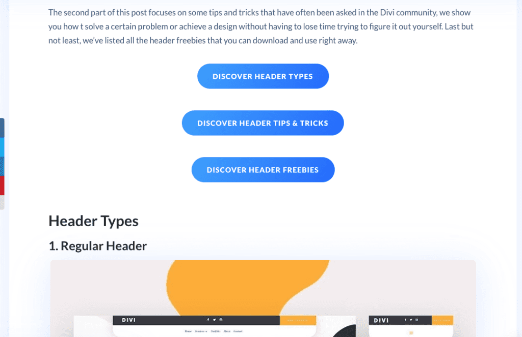
Divi makes it possible to create different headers, from slide-in to vertical headers. They have shown how to achieve these with their daily tutorial publications. This post has been created to help you navigate through all the different header type tutorials and other header related freebies ET team have published so far. This is a good place to start if your requirement is relating to the header.

5. Custom Global Header
Sometimes, you might want to use a single header for your entire Divi website; with Divi’s theme builder, it is easy to achieve. In this article, the writer guides you through how to create a custom global header using the theme builder.
6. Sticky Custom Headers
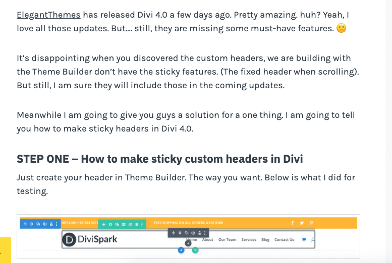
Want a sticky header that remains on the top while the user scrolls? This article guides you step by step on how you can achieve this on any Divi website easily using Divi Theme Builder and some custom code.

7. Vertical Navigation Menu/Header
Horizontal Headers / Navigation Menus seem to be the new norm for web design; In some cases, requiring going for a vertical Navigation menu / Header might just work best for user experience. This article shows you how you can create a vertical navigation menu using Divi.
8. Custom Mega Menu
For eCommerce sites that need to display more categories and products via the menu, this article explains how to create custom mega menus using the Divi Theme Builder in simple steps.
9. Responsive Slide-In Menu
In most cases, you’ll find yourself using just the horizontal menu for your Divi websites, but this is not the only header layout available in Divi. In this article, the writers walk you through how you can create a responsive, animated slide-in menu using the Divi theme builder.
10. Custom Fullscreen Global Header
If you prefer to have a full-screen header instead of the default horizontal bar, this article walks you through how you can do just that. The fullscreen header is triggered when a hamburger clicks and uses a smooth transition to fill up the screen. The fullscreen Global header in this tutorial is entirely responsive too.

11. Stagger-Animated Hamburger Menu
Continue on from the above full-screen header tutorial here you will learn how to add advanced look and feel to that header design.
12. Save Space in Your Header Using Toggle Icons
Have too many elements on your header? With toggle icons, you can create more room and have a cleaner user interface. This tutorial teaches how to create toggle icons to save space on your headers and get more information across in a non-intrusive way.
13. Animate Divi custom-built global header
Creating custom-built global headers is one thing; to get them to feel like actual headers requires something else, and in this case, it’s adding a simple animation effect. The header is one of the most crucial parts of your website that handles both navigational and branding.
Making it more noticeable with animations can improve the user experience. In this article, the writer guides you on how to add animation to a custom-built Divi global header using the theme builder.
14. Global Transparent Floating Menu Bar
Are you trying to figure out how to get your menu bar to float and be a part of your Hero section? In this article, the writer explains how to add the floating effect to a menu bar and make it transparent to fit any background.
15. Swap Divi Header for Another One on Scroll
Swapping headers? Is that even possible? With Divi Theme builder and some additional custom code, it is. In this article, the writer walks through how you can swap your Divi page’s header for another one on the scroll. So when a user scrolls down the page, the header automatically changes to another set header.
16. Shrinking Global Header When Scrolling
Want to add some extra spice to your header? The writer here shows you how to add a shrinking animation to your Divi website’s global header using the theme builder. So when the user is at the top of the page, you have a standard height header, and on-scroll, the header shrinks in height.
Custom Footer Template Tutorials
The footer basics you should learn before embark on more complex designs are covered in this tutorial. We suggest you to watch it before going through other footer guides in this article.
17. Add Post Category Menu Widgets to Divi Global Custom Footer
If you would like to add a category widget to your footer, then this article shows how to do just that. When you build a custom footer with Divi theme builder, there are different ways of adding footer items, and this tutorial shows you the best possible way to add Post Category Menu items.
18. Floating Footer Drawer
In most websites, a user has to scroll to the bottom of the page before they can access the footer, in this article, the writer shows you how to create a custom floating footer drawer that can be used to trigger the footer display from any part of the page.
19. Fixed Footer Bar
Sometimes, your footer might contain some useful information that you want the user to have easy access to at any position of your site. Normally, footers are static and stuck to the bottom of the page; in this article, the writers walk you through creating a fixed floating footer bar using the Divi theme builder. This footer sticks to the bottom of the screen while users scroll, so they get to access any information on the footer easily.
20. Mobile Contact Bar with Click-to-Call
When it comes to mobile web users, the most important thing is getting your call to action in front of them as smoothly as possible. Adding simple buttons doesn’t always get the job done, especially when there is a lot of content separating the user from your call to action. It’s hard to scroll through a 3,000-word article just to get your phone number on mobile. In this tutorial, the writer shows how to create a fixed footer contact bar with different call to action options like email, phone number, location, and social direct messaging channel. This makes it easier for mobile users to quickly contact you when they feel convinced about your website offering.
Custom Post Template Tutorials
21. Designing a Blog Post Template
In this article, you’ll learn how to create a simple blog post template with Divi; this teaches more of the concepts than a specific design, so if you’re having issues creating new blog post templates, this tutorial would be perfect for you.
22. Display Estimated Reading Time and Word Count
It’s useful when users can know how long it would take to read an article and the word count beforehand; making such stats available makes for a better user experience and can increase the time user spends reading your content. In this article, the writer teaches you how to add Reading time and word count section to your Posts using the theme builder.
23. Dynamic Post Info Bar
With Divi, there’s always a better way to display information non-intrusively. A straightforward format is using a dynamic Post info bar that floats along with your post content. In this article, the writer goes through the steps needed to create a dynamic post info bar using the theme builder. You can use the dynamic post info bar to display important information you’re trying to get across to your users, i.e., Newsletter sign-ups.
24. Split Screen Blog Post Template
In this article, you’re going to learn how to split the screen of your blog post layout into two. The left-hand side would be the featured image and author, while the right would contain your post content. This is a useful layout for cooking recipes, and travel blogging as it gives feeling that you’re reading a book. This only looks split horizontally on PCs; the mobile view looks like a regular Blog post.
25. Dynamic Author Box
Adding an author box at the end or side of your blog posts is an excellent way to wind-up your presentation. In this article, the writer guides you through designing and implementing a dynamic author box in your blog post template.
26. Scroll Triggered Popup
Would you like to show a popup when a user scrolls down a page? With the Divi theme builder, you can easily design this functionality. This article covers on how to implement Scroll triggered Popups on any page in your Divi website. You can use this to collect emails, get users to sign up for an offer, or to display promos.
27. Using the Post Module
This article covers how to use the Post Module in Divi theme builder to create custom post templates. This tutorial will come handy if you don't like the default Divi blog archive page and want to customise it.
28. Add a Sticky Category Menu to Your Blog Template
When new visitors read through your articles, having a navigation bar visible throughout their screen allows them to notice all the categories your site covers. If a visitor decides to check out other content in your website, the navigation bar is also the first place they’ll look at; making it easier to get to the navigation makes for a better user experience; and will increase click-through rates. In this article, you’ll learn how to add a sticky category menu to your blog post template using the Divi theme builder. The article also shows you how to implement a bottom sticky navigation menu on mobile to duplicate the same effect.
29. Dynamic and Simple Blog Post Template
This article shows you how to create a dynamic and straightforward blog post template using the Divi theme builder. The template focuses on simplicity while highlighting your content for better readability.
30. Category Page Template
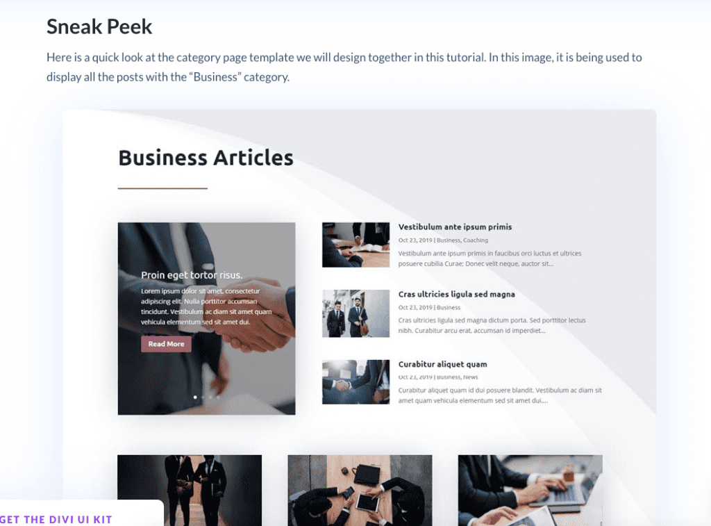
Many themes neglect the category page design and create bad-looking blog archive layouts that just don’t cut it. With Divi Theme builder, you can easily create your category page template to look precisely how you want it to add any functionality that Divi can conjure. In this article, the writer guides you through creating a category template using the Divi theme builder from scratch. No more PHP and fiddling with CSS files; you can do this right in Divi using all the simple Divi concepts you already know.

Conclusion
This article has gone over 30 different theme builder tutorials that teach how to design most important sections in your Divi website. We hope you find these useful and simple enough to work with.
We hope you found this roundup helpful; if you think we have missed anything, feel free to mention those tutorials in the comment section below.
NEXT: 30 Must-See Tutorials for Mastering How to Use WooCommerce with Divi

