Table of Contents
Today I started on a new project and the client wanted to have a slide-in menu on his website. As you already know Divi has that functionality. But.. always the same boring hamburger menu icon. Isn't it? Ohh.. 🙁 I am tired of it now. How about having an icon that better matches our website styles and branding. Okay then, let's talk about how to change the Divi hamburger menu icon or Divi mobile menu icon to something unique
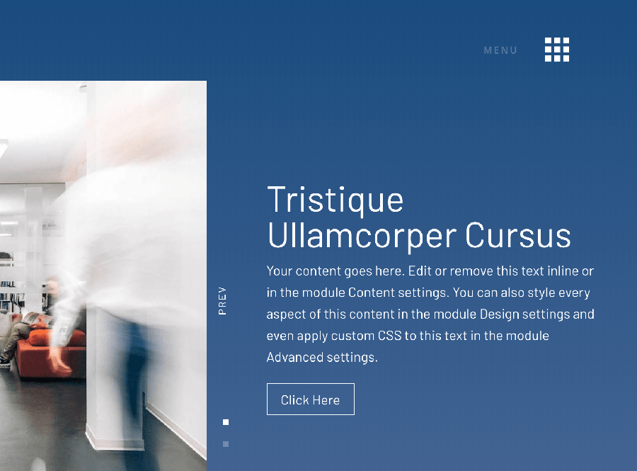
So, I wanted to change it to something new and unique. Finally, I ended up with the following design.
Important: This is for Divi full-screen menu or Slide-in menu formats only.

What do you think? looks better, right?
Let me tell you how I did that. So, you can do the same and have a unique menu icon on your site too. 🙂
Give superpowers to Divi theme with the UDBA plugin
Step One - Changing the Divi hamburger menu icon
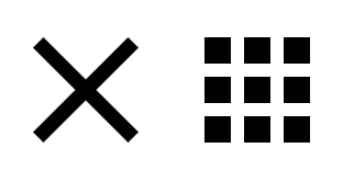
First, prepare your icons. You need two. One for opening the menu and one for closing the menu. You can create your own or download something from flaticon.com. They have a great collection of icons. Below is what I used from flaticon.com

Icon sizes should be 2x bigger. So, if you want to have a 30px by 30px icon on the website yours must be 60px by 60px. That's for Retina displays. Otherwise, it will look blurry on high-resolution displays. Normally you can't change the Divi hamburger menu color. It's just taking the color from the accent color you choose. In our case, it's easier to re-color the icons to match with our header background color/Theme colors. Finally, export as PNGs. I used Photoshop here to do the re-coloring task. Then upload the two files to your website's media library.
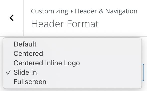
Please change the menu layout to full-screen or slide-in format.

Step Two: Add custom CSS
Next, add the below CSS code to Divi Theme Option's Custom CSS area or WP Customizer Additional CSS area or to your child theme's style.css file. (use any method you use to add custom CSS). One other way is to use a 3rd Party plugin like Simple Custom CSS or follow this tutorial.

/*_____Custom Hamberger Icon_____*/

.et_pb_header_toggle::before {
   content: " " !important;
   position: absolute;
   background: url("https://.yoursite.com/menu.png");
   background-size: 30px 30px;
   width: 30px;
   height: 30px;
}

.et_pb_header_toggle::after {
   content: " " !important;
   position: absolute;
   background: url("https://.yoursite.com/menu.png");
   background-size: 30px 30px;
   width: 30px;
   height: 30px;
}
Please change the background image URLs to your icon's URLs. Save it. Go to the front-end and refresh. Now you will see that the default Divi hamburger menu icons have changed.
Great!! You did it 🙂
If you want to add the 'MENU' text on the left side of the icons, similar to what I have done there, please copy-paste the below CSS code too. That will do the trick. Play with the 'top', 'right' position values to align the text with the icon.
div#et-top-navigation::before {
   content: 'MENU';
   position: relative;
   top: 15px;
   right: 8px;
   font-size: 16px;
}
That's all about changing the Divi hamburger menu icon to something unique guys! Congratulations 🙂
