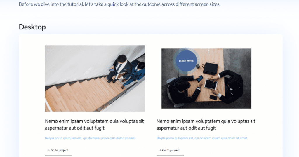
Table of Contents
Divi Position Options Introduction
Positioning elements on a web page can be complicated, especially if you have little experience with CSS positioning properties like flexbox, grid, and block. This can sometimes limit what you can design and cause you to leave out or find workarounds for page elements you can’t seem to position correctly.
Again, with extensive knowledge of how CSS positioning works (absolute, fixed, relative), you can virtually do anything, but what if you’re not a CSS wizard or lack the time required to learn the concepts for a project?
Well, that’s where Divi Position Options comes in. it possesses incredible features that unlock the much-needed freedom sort out by Divi users in terms of page element positioning.
Give superpowers to Divi theme with the UDBA plugin
Elegant Themes Announcement About The New Divi Position Options Feature
The Divi Position options tool, which was introduced to the Divi builder on January 16, 2020, is an all-new way to implement CSS positioning properties on any element present on the Divi builder page canvas. It is designed to give Divi users the much-needed control required to move elements on the Divi page editor to any absolute or relative position desired irrespective of any parent-child constraints. You can also make any element fixed to a specific location irrespective of scrolling, e.g: headers, banners, and images.
Want to create fun overlapping image effects? Well, no need for hardcoded workarounds anymore; with Divi Position options, it’s just a matter of dragging and dropping an element on top of another. This feature work with all Divi layouts and child elements, from sections and columns down to individual elements.
Complete feature walk through

You can learn more about this new feature by watching the YouTube video above. It's a complete beginner guide to this new position options system.
After getting familiar with this new feature lets now explore the 20 Divi tutorials that we think are the best uses of this effect.
20 best practical use cases of Divi Position Options
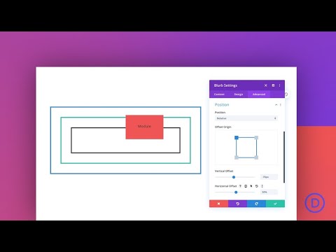
1. A Guide to ABSOLUTE Position
Absolute positioning is one of the four positions available with the Divi Position Option feature and, in many ways, the most complicated for beginners with no prior CSS knowledge.
This tutorial by Elegant Theme’s staff writer explains all you need to know about absolute positioning and guides you with a few examples of how you can implement and use this position with any Divi element. The tutorial also educates you on the benefits and drawbacks of using absolute positioning and absolute positioning location points.

2. A Guide to RELATIVE Position
Relative positioning is one of the four positions available with the Divi Position Option feature and is the default position for all elements added to the Divi canvas. This tutorial explains all you need to know about relative positioning and guides you with an example of how relative positioning works for all Divi Elements. The tutorial also educates you on five reasons for using the Relative Position in Divi, Relative Position vs. Margin, and finally, Relative Position vs. Transform Translate.
3. A Guide to FIXED Position
Need an element to remain fixed at a specific location on a page even when a user scrolls? The Fixed Position attribute does just that; with Divi’s Position Options implementing this property is easy. This tutorial explains and guides you through how you can make any Divi element remain fixed at a specific location irrespective of browser viewport or scrolling. The tutorial also educates you on Tips to Keep in Mind when Using Fixed Position and six ways to use the Fixed Position in Divi if you don’t have an implementation in mind.

4. Create an Interactive Image Collage
Divi’s new position options give your layout a whole fresh feel with the benefit of precise placement for each element. And once you combine that with all the design settings within Divi, it makes designing an image collage fun and easy!
This tutorial by Elegant Themes walks you through step by step to build an interactive Image collage using built-in Divi features and the new Position Options. If you’re tired of using plain old image collages, you’ll find this tutorial helpful in creating an image collage your site visitors will be proud of.

5. Create a Fixed Header
If you want to make sure that your navigation is always in sight, then a fixed header can do the job. With Divi’s new position options, turning your static headers into fixed headers is easier than ever. It doesn’t matter if it’s a custom-made header or an inbuilt one; the position option features allow assignment of the Fixed property to any header.
This tutorial walks you through step by step how you can convert any static header into a fixed position using the new Position Options. Navigation is essential for every website, and a fixed header does the UX trick of allowing easy access to navigating to different pages without much stress.

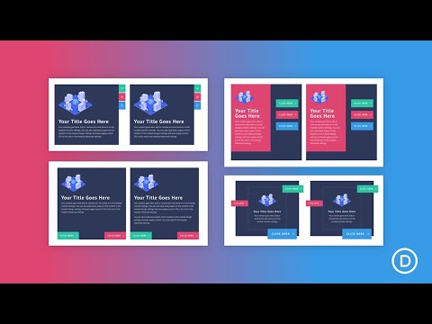
6. Create Unique Button Layouts
Buttons are a massive part of a page and the actions a user can take; creating buttons with Divi is straightforward, but what if you need them at a specific location? That’s where Divi position options come in. With Position options, creating uniquely positioned buttons has been simplified.
In this tutorial you will lean how to create four different button layouts and position them anywhere using the Divi Position Options. If you want to take your call to action game to another level, then you’ll find this tutorial helpful, as placing buttons at specific locations have proven to lead to higher click-through rates.
7. Create Image Bundles
An image bundle is a terrific way to showcase a product or a group of images. The default behaviour of the Divi page builder only allows one image per column, but with the new Position Options, you can easily overlap and place pictures in a single column or section. This tutorial by Elegant Themes shows you how to design three creative image bundles using the new Divi Position Options. Once you practice the concepts taught in this tutorial, you should be able to create custom image bundles of your choice.

8. Include a Slide-In Column Contact Form
A contact form is one of the first elements you would consider for a web build. One approach is to include a contact form in your hero section, allowing people to get in touch with you without navigating further on your site.
If that’s not quite what you had planned, another idea is adding an easy-to-use slide-in column contact form using Divi built-in options. This tutorial by Elegant Theme shows you how to add a slide-in column contact form to your hero section using the new Divi Position Options.

9. Change the Style of Multiple Elements on Hover or Click
Web Designers always looking for ways to improve UX of their Divi websites. Sometimes this involves using Javascript/JQuery to change the style of elements on the page, such as changing an image when hovering over a link or making a contact form appear when clicking a button. This tutorial by Elegant Themes guides you through how you can change the style of multiple elements triggered by a hover or click event.
Though this tutorial does rely on custom Jquery and CSS code, it’s not as complicated as you might think. If you want to add a little bit of interactivity to your Divi Pages, then this tutorial should bring you a step closer.

10. Add an Absolute-Positioned Bottom Bar to a Hero Section
One of the most challenging things you would find when working on a hero section is structuring its content. You want it to be balanced but not too crowded, cluttered, yet informative. Luckily some approaches can help simplify things and make them more visually appealing at the same time.
One example would be adding an absolute-positioned bottom bar - this way, you don't have to worry about cluttering up space on top while also having plenty of room for call-to-actions in the middle.
This tutorial guides you on adding an absolute-positioned bottom bar to your hero section using Divi’s inbuilt Position Options. The bottom bar will consist of 4 columns, three of which will feature buttons and the fourth featuring a simple contact form. You’ll also be able to download the JSON file for this design if you run into any problems replicating it.

11. Design a Hero Section with Custom Transitions and Animations
How can you make hero section stand out from the rest? Adding smooth transitions and animations to showcase the content is one way.
Divi offers a basic slider module that can be used in your hero section but these can add unnecessary weight to your page. With some outside-the-box thinking, you can design a lightweight hero section with unique animations or transition effects. In this tutorial you will learn how to design an attractive hero section using Divi position options.

12. Add a Styled & Inverted Cursor
It all starts with the cursor – User interaction on a website is almost entirely based on how visitors use their cursors to navigate your pages. It’s also one of the only things that allow them to trigger events, whether a hover or click. That’s why you will often come across websites where designers customize and stylize this element for specific purposes; such as highlighting call-to-actions - which can lead users towards completing specific tasks on your website.
This tutorial by Elegant Themes guides you on adding a stylized inverted cursor using Divi’s Position Options. Once you practice the concepts taught in this tutorial, you should be able to create any custom cursor that might come to mind.

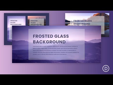
13. Create a Frosted Glass Background Design
Adding a frosted glass background to your website can be an exciting way of adding visual interest while also making text and images stand out. To achieve this effect, we first need two layers: one with the target element on top (in our case, that would mean blurred image) and another layer below it without any elements for us to blend these with transparency. This tutorial guides you on how to exactly do this practically with Divi builder.
14. Turn Your Cursor Into a Button When Hovering an Element
The best way to get people on a page to take action is by making sure they know that there are clickthrough items. However, the most obvious way of doing this without cluttering the screen may be with a button. This tutorial takes it up a notch by guiding you through how you can implement a cool cursor to button transition triggered by hovering. This tutorial relies on Divi’s Position Options for positioning and some CSS snippets.
15. Create Blurb Expanding Section on Scroll
Blurb Modules can be used to create engaging content on your website. Now with Divi’s Position options and scroll effects, you can animate them in a way that would not have been possible before. In this Elegant themes tutorial, the writer shows you how to create an expanding circular blurb layout that you can use to showcase four different Blurb Modules. The section is responsive and works on both mobile and tablet devices.
Using Divi’s Position options, the writer applies an absolute positioning property to each blurb and places them at different positions on the main circular blurb layout. If you want to add an extra navigational layout to your website, you’ll find this tutorial useful.

16. Add Motion to Background Images on Scroll
Background images are known to be static and dull in most cases, yes there are a few effects that can be applied to achieve some form of interactivity, but none come close to adding a motion effect. In this Elegant Themes tutorial, the writer will show you how to add motion to background images using Divi’s Image Module and the Divi Position Options feature.

17. Design Scroll Animated Bar Counters
Bar counters are a popular way to represent data and metrics in subtle ways. Divi has created its own bar counter module that is easy for the user to use, but oftentimes they might come across limitations when it comes to customization or animation styles which can be hard on your site’s design as well.
In this tutorial, the writer will show you how to easily create a fully customizable animated bar counter with animations triggered by scrolling using Position Options and some custom CSS snippet. This tutorial is perfect for you if you need a creative way of presenting statistical data on your Divi website.

18. Create Scroll Animated Number Counters
Continue on from Bar counters here we see how to apply similar effect to Number counters too. Animated counters can be helpful for displaying numerical data and highlighting the value of services, case studies, etc. Divi has a dedicated number counter module that you can easily use to make animated number counter.
However, in this tutorial by Elegant Themes, you’ll learn how to create an animated number counter using Divi’s position options and scroll effects, which are helpful when scrolling through content on your website or blog post.
19. Use Absolute Positioned Image Modules as Zoom-Out Parallax Backgrounds
When using a background image in your section, there are many ways to style it. From blend modes, gradient background overlays down to parallax effects. With Divi’s Position Options and Scroll effects, though, you can take styling background images to a whole new level.
This tutorial walks you through how you can use any Absolute Positioned Image Modules as Zoom-Out Parallax Backgrounds. This helps add extra depth to all your background images and improves how much the text placed on them is being emphasized.
20. Create a Sticky Audio Content Bar
Have you ever found yourself scrolling through a PODCAST website and needing to pause the audio? Maybe there is an advertisement running or perhaps it's just too hard to hear. Adding this sticky bar will give your users easy access to these controls and their browsing experience isn't interrupted.
In this tutorial, the writer is going to show you how to use Position options and one of Divi’s built-in features in a creative way by building an audio content bar that stays at the top of your screen as you scroll down. You will also learn how to convert existing audio on the page into a sticky music player and walk through some customization options.

Conclusion
The Divi Position Options effects are a great way to add positioning flexibility and design freedom for those not fully versed in CSS. You can use this feature to position your page elements just about any way you want, with the ability to tweak it as needed without having to worry about messing up other parts of your website's layout or breaking anything else. If you’re looking for an easy solution that will save time on your next web project, give Position Options a try.
Feel free to mention any other useful tutorial you have found about this subject in the comments sections below.
NEXT: 20 Tutorials that teach you how to effectively use Divi Hover Effects >