Table of Contents
Divi Hover Effect Introduction
There's something about hover effects and good user experience. Not only do hover effects help users understand their interactions with elements of a page, but it also adds a depth to the overall design. With Divi, adding hover effects to elements on a page is a simple and streamlined process; apart from the inbuilt effects, you can also create custom hover effects based on your needs.
Creating custom hover effects does require some coding knowledge and previous experience. Luckily Elegant Themes content team have released ton of tutorials over the years that teach you how to create and implement custom Divi hover effects based on various use cases. The more you practice and implement these hover effects, the closer you are to mastering hover effects with Divi.
In this article we have curated 20 must-see tutorials for mastering how to use Hover effects with Divi. Whether you're a beginner Divi user or have some previous experience with the builder, this article should enlighten you on the possibilities with Hover effects when building websites with Divi.
Give superpowers to Divi theme with the UDBA plugin
Elegant Themes Announcement About The New Hover Options to Divi
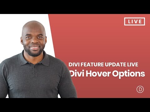
On October 4, 2018, the Elegant Themes Team announced the new hover effect feature, which simplified the creation of mouseover-based interactions. With it, an element on the Divi page builder canvas can be animated with an on-hover trigger. The implications of this new addition has been demonstrated with a series of use case tutorials which we will list out next.
This feature is further explained on the announcement post.
Complete feature walk through
The video above teaches you how to use Divi hover effects and takes you from absolute beginner to an intermediate level.
After getting familiar with this new feature lets now explore the 20 Divi tutorials that we think are the best uses of this effect.
- The list includes some tutorials that were published before this new feature introduced to the Divi builder which made implementation much easier. These old tutorials will help you understand the underlying code and concept behind the effect. We suggest you to try out these tutorials that show how to create this effect manually in your test environment as a learning exercise.
- We have mentioned in the heading if the tutorial is based on the new Divi builder Hover options [Uses Divi Builder] , or custom code to implement the effect [Uses Custom Code].
20 best practical use cases of Divi Hover Effects
1. Triple Card Hover Effect [Uses Divi Builder and Custom Code]
This tutorial written by Jason Champagne teaches you how to recreate the design of Elegant Themes layout pack previews with an impressive fan-out hover effect in Divi. This would work great on landing pages or product showcases. Because this project requires some custom CSS and using Divi's built-in features, it may be more complex for beginners.
2. Seamless Hover Grid [Uses Custom Code]
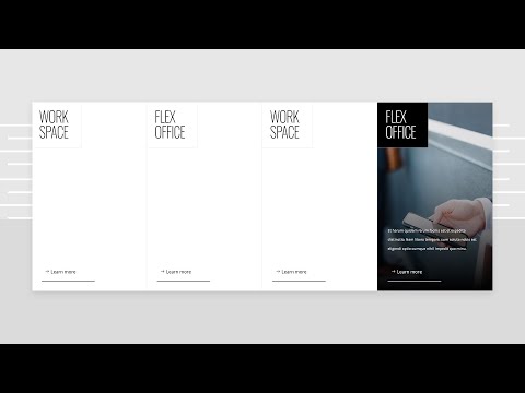
Here, the writer teaches you how to create a seamless hover grid with Divi. The Hover Grid features a clean and simple design; when an item in the grid is hovered on, a background image is revealed, and the module style changes with it. This tutorial is perfect for product categories and any form of content you want to show inside a grid.
3. Zoom forward effect to Divi pricing table [Uses Custom Code]
If there’s one thing that’s common with pricing tables, it’s the fact that they are usually boring. Apart from conveying information about a product or a service, it’s always the same flat page design with no effects. This tutorial by Rob Hobson attempts to fix this by showing you how to implement a Zoom forward effect on your Divi pricing table on hover. When the user hovers over any of the pricing table card, it zooms forward, slightly highlighting its content. Implementation is simple but it does require some CSS code.
4. Use Hover.css to Add Advanced Hover Effects to Divi’s Blurb Module [Uses Custom Code]
In this Divi tutorial, the author shows you how to add some advanced hover effects to your blurb modules using Hover.css and make them stand out from all of the other blurbs on a page. Of course, with Divi's default settings, there is no need for any additional tweaking because it has what you need right out of the box but if you're looking at creating more custom blurb design, then be sure to check this tutorial.
5. Floating Pop-out Menu [Uses Divi Builder and Custom Code]
You will get to learn how to create a floating pop-out menu in Divi. The writer uses Divi's accordion modules for its menu functionality. Then with some coding he make the according menu stick to the side in closed sate. The menu gets opened when being hovered over.
A floating pop-out menu is perfect if you’re trying to save space at the top and give users an easy way to access the navigation menu from any part of your website.
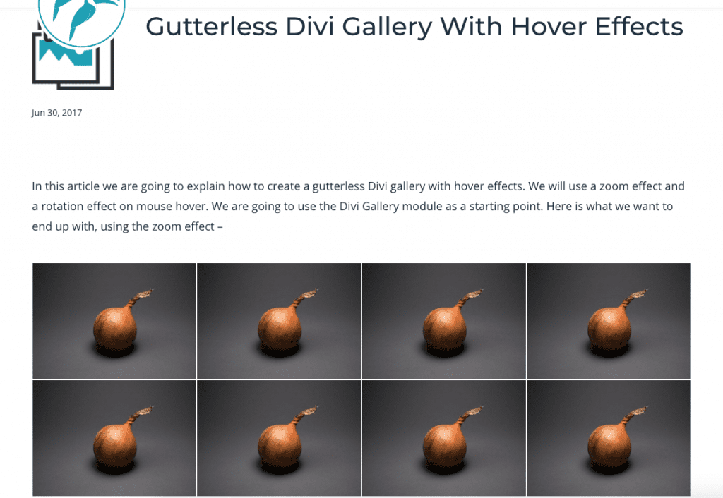
6. Gutterless Divi Gallery With Hover Effects [Uses Custom Code]
If you're looking to create a slick, gallery-style Divi layout without the unsightly gutter we've all grown accustomed to and with some cool hover effects thrown in for good measure, then this tutorial is for you.
7. Layered Hover Effect To Divi Person Module [Uses Custom Code]
Want to spice up how your Divi person modules? In this tutorial by Ivan Chi, you'll learn how to implement a layered hover effect to any Divi person module. To make this work, Ivan add a class (layered-effect) to the person module and provides a CSS snippet to trigger the effect.
8. Image Hover Effect Free Divi Layout [Uses Custom Code]
Paul Yates in this tutorial, shows you how to implement an Image Hover Effect that triggers a caption with smooth transitions. The effect uses the Divi Image and Call to Action modules; you start by adding a background image and a CTA module with title and description, then finishing CTA button to serve as the link. If the tutorial seems a bit advanced, the writer has provided a free and easy to install layout file, which allows you to skip all the steps and just import ready-made effect on your Divi site.
9. Style Divi Blurbs With 3D Hover Effects [Uses Custom Code]
In this tutorial, the writer is going to introduce a creative way to animate an object on mouse move. But that's not all. He'll also show you how to combine mouse move animation with a hover effect that makes elements pop out like a 3D element, which brings your content come alive in new and exciting ways! To make sure it looks great across various browsers like Google Chrome or Safari- he uses Divi builder for the bulk of the design, then some custom CSS3 and JQuery animations to bring everything together beautifully.
10. Add Hover Social Icons to Divi Person Module [Uses Custom Code]
In this post, the writer shows you how to get creative with your team member showcase. More specifically, you will learn how to trigger social icons when a visitor hovers one of team member images.
11. Beautiful CSS Hover Effects You Can Add to the Header [Uses Custom Code]
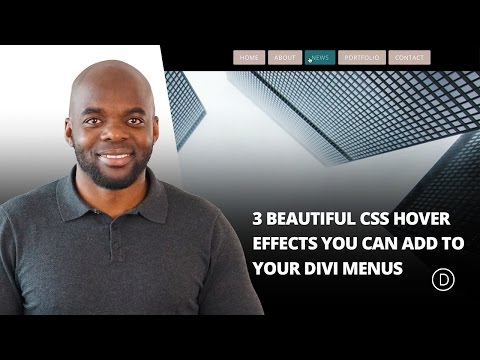
Your menu is one of the first things visitors see, so you want it to be as stylish and attractive as possible. That's why in this article the writers teaches you three ways to add beautiful hover effects with custom CSS that really pop on any screen size! These Hover Effects is one of many simple tricks for making otherwise static navigation more interesting.
12. Change an Image on Hover [Uses Divi Builder]
This tutorial explains how to change an image when it is hovered over. You can utilize column backgrounds, opacity filters, smooth transitions and other cleaver tricks to improve user experience. This tutorial uses default Divi builder options only so you need not to add any custom code.
13. Place Hover Tooltips on Any Element [Uses Divi Builder]
Learn how to create hover tooltips that you can set to appear on hover on any element. You can use tooltips to display more information about something without taking up space or messing up the page layout. It's a very handy trick may modern websites use.
14. Change Content on Hover to Create Unique CTAs [Uses Divi Builder and Custom Code]
Need a new way to entice your visitors into clicking on those pesky call-to-action buttons? You're in luck! In this tutorial, you will learn some cool tricks you can add to CTA sections on hover. You will learn how to change button text, icon, add transitions and overall make the CTA section appealing when a visitor hover over it.
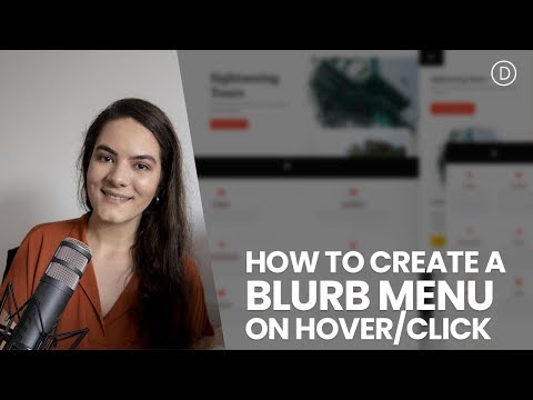
15. Create a Blurb Menu on Hover [Uses Divi Builder and Custom Code]
Here you will learn how to create a stunning blurb menu that expands once hovered or clicked. This is a great way to add interactivity to your menu while still remaining readable and usable on any screen size.
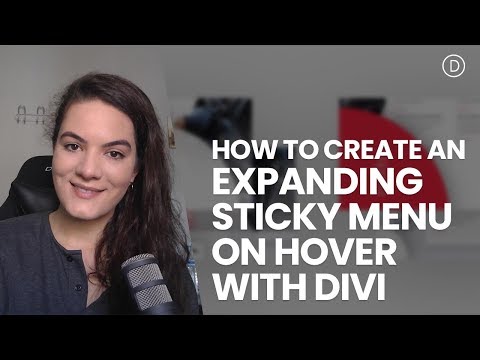
16. Create an Expanding Sticky Menu on Hover [Uses Divi Builder and Custom Code]
In this tutorial, you’ll learn how to make your menus expand when a user hovers over them. Two different sticky menu design examples are provided so you can easily reproduce the look.
17. Create Unique Social Media Follow Button Hover Effects [Uses Divi Builder]
Divi's Social Media Follow module allows you to easily style and add those crucial links to your social networks anywhere on your website. And if you want to get your hands dirty with some of Divi's powerful built-in hover effects, you can design some creative hover effects for your social media follow buttons as well.
18. Reveal Content with a Shutter Hover Effect [Uses Divi Builder]
Revealing module content on hover can have some practical benefits. For one, It can be a great way to have a more compact and elegant design. It also saves space and entices users to interact with your page. The basic idea is revealing only the portion of the module that you want visitors to see (like an enticing teaser), which makes it seem like they need to know what's behind the curtain - but once they do navigate over the edge, then everything will get revealed at once smoothly without them needing click any pesky buttons. The writer in this tutorial will show how to reveal Divi modules with shutter-style hovering effect.
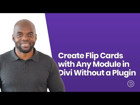
19. Create Flip Cards with Any Module in Divi [Uses Divi Builder and Custom Code]
Want to build some cool flipping cards in Divi? You can! In this tutorial, you'll learn how to d exactly that using Divi's built-in options, No additional plugins or jQuery are required.
20. Use Divi’s Hover Options to Creatively Emphasize CTAs [Uses Divi Builder]
In this post, the writer gives three unique ways to get your CTAs into the spotlight using Divi’s hover options. These examples should hopefully inspire you to think outside the box when it comes to creating your CTA designs.
21. Animate Titles Using Divi’s Hover Options [Uses Divi Builder]
In this tutorial, the writer will show you how to create hover effects for your titles. By emphasizing specific pieces of information and words in the page, you can draw attention where it’s needed and even trigger action from visitors.
22. Create an Expanding Hover Effect for Your Grid Layouts [Uses Divi Builder and Custom Code]
The techniques taught in this tutorial are simple ways to create a pleasing hover effect for your entire grid. But there are endless possibilities. You can expand portfolio or shop modules, as well as blog modules. Your imagination is the limit, so get creative and have fun discovering yourself.
23. Design 3D Photo Walls [Uses Divi Builder and Custom Code]
If you’re looking for a way to add depth to your photo gallery designs, check out this guide that shows you how to use Divi’s built-in transform options and a line of CSS code to create 3D designs.
24. Use Section Divider Height Hover Effects to Reveal Content [Uses Divi Builder]
Divi lets you adjust the height and arrangement of each divider. You can set dividers to hover or fade in or out, based on the content behind it. This is a great way to draw attention to certain areas, such as a call to action or a button, and make them stand out from the rest of your site.
Conclusion
These tutorials are perfect for any Divi beginner. We also included some more advanced techniques that you may not be familiar with yet, so even if you're a pro, there's something new to learn here! Please share your thoughts in the comments below and let us know which of these hover effects you use most often when building websites with Divi.
NEXT: 20 Tutorials that teach you how to effectively use Divi Position Options >
